

The Best Fall Wedding Colors for 2026 — and How to Actually Use Them
Most fall weddings default to the same palette: burnt orange, deep burgundy, maybe some gold. It works — but it's also what every other fall wedding looked like for the past five years. In 2026, the couples getting the most interesting results are working with a broader, more nuanced range of autumn tones. Here's what's actually working this season and how to use it.
Quick Answer
The best fall wedding colors for 2026 are deep plum, terracotta, sage, champagne, forest green, and burnt cedar. The shift this year is toward more muted, earthy tones rather than saturated jewel colors — palettes that feel warm and organic rather than theatrical. The key isn't picking one hero color but building a combination of 2–3 tones with a clean neutral to anchor them. Burgundy still works — but only when it's balanced, not dominant.
In this article
What Are the Best Fall Wedding Colors for 2026?
The defining shift in fall 2026 wedding palettes is a move away from high-saturation jewel tones toward warmer, more organic colors that feel grounded rather than dramatic. Think less "Halloween pumpkin orange" and more aged terracotta. Less electric burgundy, more deep plum with dusty undertones.
This reflects a broader aesthetic direction in weddings this year — couples are gravitating toward palettes that look good in natural and golden-hour light, that translate well to film photography, and that don't date quickly in photos viewed years later. Earthy, warm, and slightly muted consistently outperforms bold and saturated in long-term satisfaction.

Top Fall Wedding Color Palettes for 2026
Deep Plum + Champagne + Sage
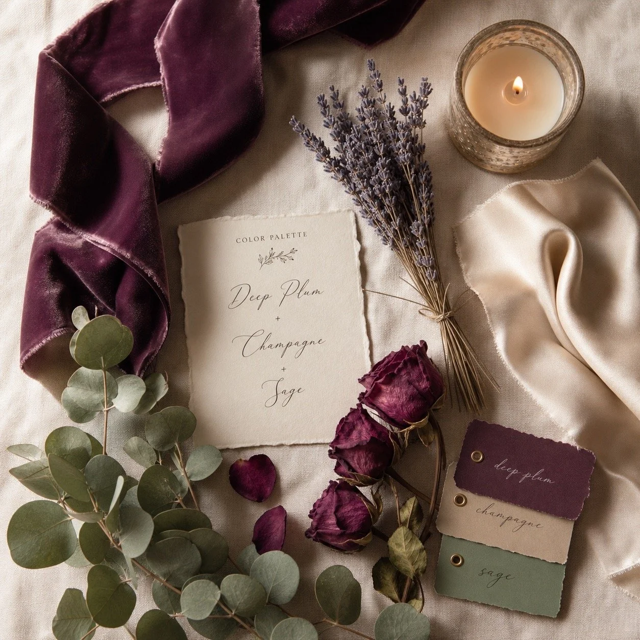
This is the standout palette of fall 2026. Deep plum — not bright purple, but a dark, wine-adjacent tone with grey undertones — pairs beautifully with warm champagne and the muted green of sage. The combination reads as sophisticated without being cold, and it works across venue types from forest estates to industrial lofts.
In practice: plum bridesmaid dresses or suit accessories, champagne table linens, sage and dried eucalyptus in florals, ivory candles. The palette photographs exceptionally well in low-light and golden-hour conditions.
Who is this for: Couples who want a fall palette that feels modern and elevated without being predictable. Works especially well for evening receptions and candlelit venues.
Terracotta + Warm Ivory + Burnt Cedar
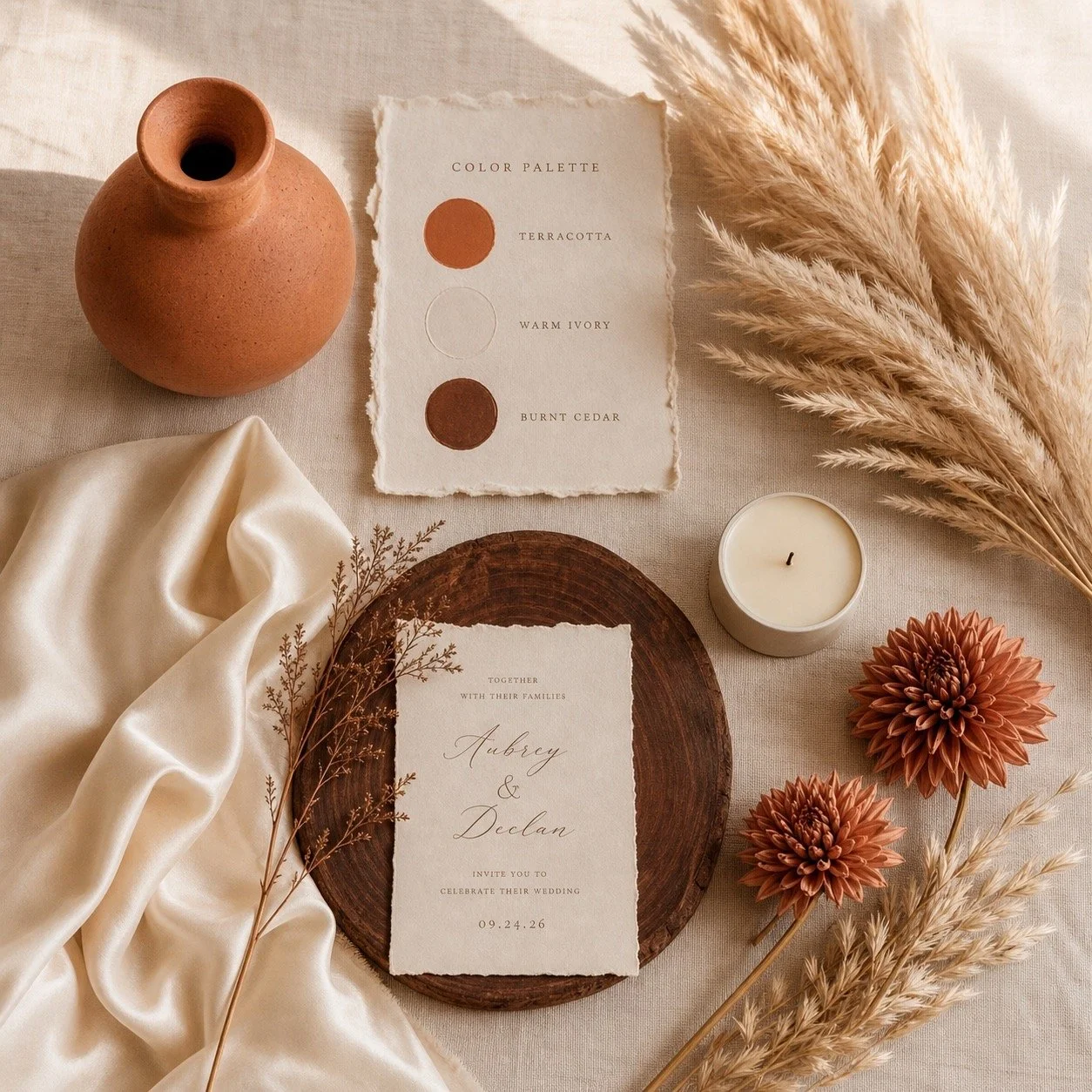
Terracotta remains strong in 2026, but the version that works now is warmer and more muted than the bright clay tones that peaked a few years ago. Paired with warm ivory — not stark white — and the deep reddish-brown of burnt cedar, this palette feels like the landscape of a late October afternoon.
In practice: terracotta linen napkins and velvet ribbon details, ivory florals with dried grasses and pampas, cedar-toned wooden elements in the tablescape. This palette works particularly well outdoors and in rustic or garden venues.
Who is this for: Couples planning outdoor or semi-outdoor fall weddings, barn venues, vineyard estates, or anyone who wants a palette that feels genuinely connected to the season rather than just referencing it.
Dusty Rose + Copper + Mocha
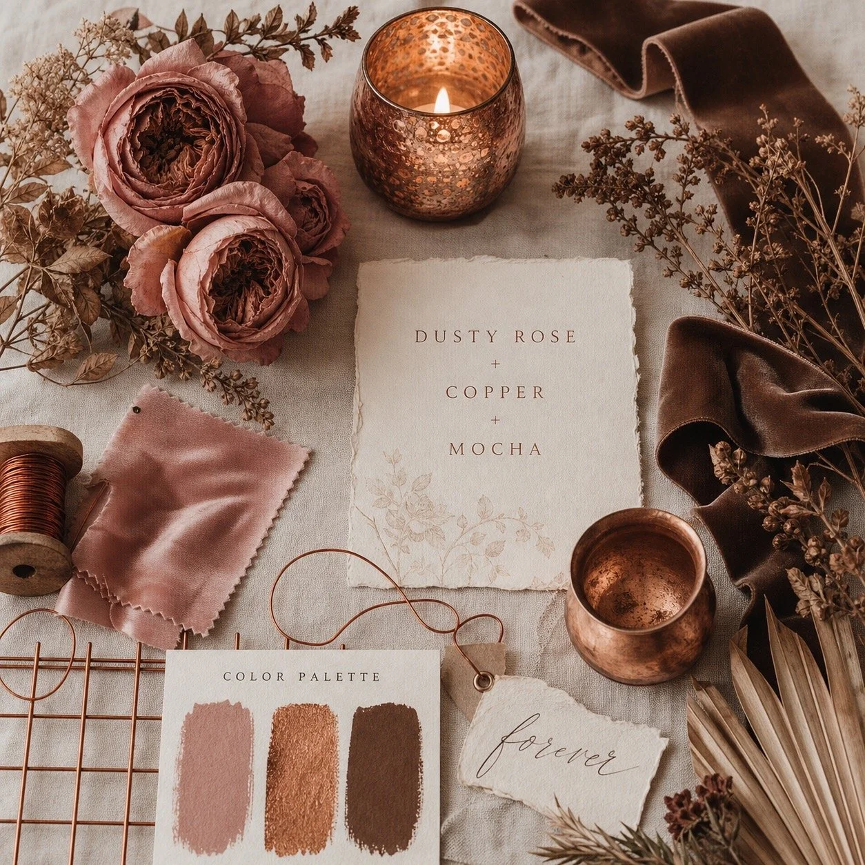
A softer fall palette for couples who want warmth without darkness. Dusty rose — not the bright blush of summer — sits beautifully next to copper metallics and the deep neutral tone of mocha brown. The result is romantic without being overly feminine, and it balances well in both photographs and on-site.
In practice: dusty rose florals with copper vessels and candle holders, mocha-toned linens, bridesmaid dresses in either the rose or mocha tone. Copper catches candlelight exceptionally well — this palette performs best in evening or indoor receptions.
Who is this for: Couples who want a romantic fall palette that avoids the darkness of plum or burgundy. A good choice for daytime or late-afternoon ceremonies.
Forest Green + Rust + Cream
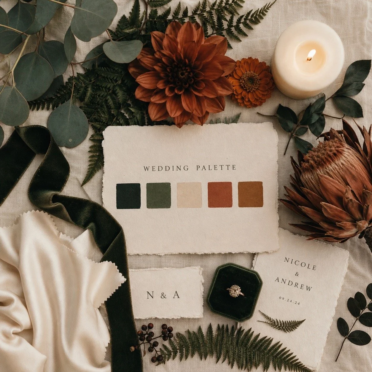
Deep forest green has become one of the strongest color directions in fall weddings over the past two years — and in 2026 it's at its peak. Paired with rust (not orange — rust is darker, more complex) and grounded by cream rather than white, this palette feels rich and intentional.
In practice: greenery-heavy florals with rust-toned blooms (dahlias, marigolds, dried protea), cream tablecloths, green velvet ribbon or napkins as accent. This is one of the most photogenic fall palettes — the contrast between forest green and rust reads beautifully in both film and digital photography.
Who is this for: Couples who want a strong, nature-forward palette with a slightly editorial feel. Works across venue types but looks exceptional in outdoor, wooded, or garden settings.
Burgundy + Blush + Gold — Updated

Burgundy isn't gone — it just needs updating. The version that feels current in 2026 uses burgundy as an accent rather than the dominant tone, paired with soft blush (not hot pink) and warm gold rather than yellow-gold. The result is warmer and more balanced than the saturated burgundy-and-greenery combination that defined fall weddings a decade ago.
In practice: burgundy floral accents and ribbon details, blush as the primary bridesmaid color, gold in the tableware and candleholders. Keep the burgundy at roughly 20–30% of the palette — it should punctuate, not overwhelm.
Who is this for: Couples drawn to the classic fall aesthetic who want to update it rather than abandon it entirely.
🍂 Want to see how these palettes look in real wedding photos and film?
Browse Arrakis Films' wedding gallery — fall weddings shot in natural light, on 35mm film, and in Super 8 across NYC and LA.

How to Use Fall Colors in Your Wedding
Choosing a palette is the easy part. Using it consistently and intentionally across all the visual elements of the day is where most couples struggle.
Florals and Centerpieces
Florals are where your palette lives most visibly. For fall 2026, the arrangements that work best mix textural elements — dried grasses, seed pods, pampas, dried citrus — with seasonal blooms like dahlias, garden roses, marigolds, and cosmos. The dried elements add depth and a seasonal quality that fresh-only arrangements can lack.
One practical note: brief your florist on the specific tones you want, not just the color names. "Burgundy" means something different to every florist — bring reference images and, if possible, swatches.
Bridesmaid Dresses and Suits
For bridesmaid dresses, mismatched tones within the same palette family consistently photograph better than identical dresses — slight variation in depth and tone adds visual interest without looking uncoordinated. For groomsmen, a suit in a neutral from your palette (mocha, slate, deep navy) with a tie or pocket square in the accent color keeps the palette cohesive without overdoing it.
Wedding Cake and Stationery
Stationery is often where couples first commit to their palette — and where the choices ripple outward to everything else. For fall 2026, textured paper in warm ivory or cream with ink in your deepest palette tone works better than stark white with foil printing. For cake, buttercream in neutral tones with fresh or dried floral accents in your palette colors is both practical and elegant.
Venue Lighting
Lighting is the most underused tool in wedding color design. Warm amber and candlelight-temperature lighting enhances every fall palette — it deepens reds and terracottas, warms greens, and adds richness to plum and burgundy. Avoid cool white or blue-toned uplighting with warm fall palettes — it flattens and grays the colors rather than enhancing them.
What Fall Colors Look Best in Photos and on Film?
Not all fall colors perform equally in photography and videography — and if you're investing in professional coverage, it's worth knowing which palettes translate best.
Warm tones (terracotta, rust, burnt cedar, plum) perform exceptionally well in golden-hour light — they deepen and glow rather than washing out. These are the palettes that produce the most striking film photography, particularly on 35mm and Super 8, where warm tones are rendered with grain and softness that digital can't replicate.
Deep greens and burgundy photograph beautifully in shade and overcast light — conditions that often flatten warmer tones. If your ceremony is in a forested setting or a venue with minimal direct light, leaning into these tones is a practical as well as aesthetic choice.
Neutrals (champagne, ivory, cream, mocha) are the foundation that makes everything else work on camera. A palette with strong neutrals holds together across different lighting conditions and doesn't require perfect light to look good.
What to avoid photographically: bright orange and electric burgundy both tend to oversaturate in digital photography and look dated quickly. They also don't translate well to film formats — the color rendering on 35mm and Super 8 handles muted and complex tones much better than pure, saturated hues.
🎞️ Planning a fall wedding in NYC or LA?
Arrakis Films shoots fall weddings on digital, 35mm, and Super 8 film — and can advise on which palettes photograph best at your specific venue and time of day.
Fall Wedding Colors to Avoid in 2026
A few directions that feel dated or simply don't work well this season:
Bright pumpkin orange — too literal, too seasonal-decoration-adjacent. The earthy rust and terracotta versions of this tone work; the bright version doesn't
Stark white as a neutral — cool white flattens warm fall palettes. Use warm ivory or cream instead
Oversaturated jewel tones without neutrals — electric burgundy, bright cobalt, and vivid emerald all need substantial neutral grounding to work in a fall context. Without it, they look jarring rather than rich
All-grey palettes — grey reads cold in autumn. If you want a muted palette, reach for mocha, taupe, or warm greige instead
Too many colors — more than three hero tones in a palette almost always produces visual chaos. Pick two or three and use them intentionally
FAQ
What are the most popular fall wedding colors for 2026?
The most popular fall wedding colors for 2026 are deep plum, terracotta, sage, forest green, rust, and champagne. The overall direction is toward muted, earthy tones rather than saturated jewel colors. Burgundy remains popular but works best as an accent rather than the dominant palette tone. Palettes built around two or three complementary tones with a warm neutral anchor consistently produce the strongest results.
What color is trending for weddings in fall 2026?
Deep plum is the breakout color of fall 2026 — particularly in combination with champagne and sage. It offers the richness of burgundy without the familiarity, and it photographs exceptionally well in both natural and candlelight conditions. Terracotta in its more muted, earthy form continues to be strong, and forest green has moved from trend to established fall staple.
What colors go well together for a fall wedding?
Strong fall 2026 combinations include: deep plum + champagne + sage; terracotta + warm ivory + burnt cedar; forest green + rust + cream; and dusty rose + copper + mocha. In each case, the palette works because it combines a dominant tone, an accent, and a neutral anchor. Avoid combining more than three distinct tones — it becomes visually difficult to manage across all the elements of the day.
Is burgundy still popular for fall weddings?
Yes, but the way it's used has shifted. Burgundy as the single dominant fall color feels dated in 2026. Used as an accent — in floral details, ribbon, or a small proportion of bridesmaid dresses — alongside softer tones like blush, champagne, or sage, it remains a strong choice. The key is treating it as a punctuation color rather than the whole palette.
What neutrals work best with fall wedding colors?
Warm ivory, champagne, cream, and mocha are the most versatile neutrals for fall 2026 palettes. They enhance warm tones without competing with them. Avoid stark white — it reads cold against autumn colors and flattens the warmth of the overall palette. Warm greige (grey-beige) works well with more muted, earthy palettes as an alternative to cream.
What fall wedding colors look best in photos?
Warm, muted tones — terracotta, rust, deep plum, burnt cedar — photograph exceptionally well in golden-hour light and on film formats like 35mm and Super 8. Forest green and burgundy perform well in shade and overcast conditions. Strong neutrals (champagne, ivory, mocha) provide the foundation that holds a palette together across different lighting conditions. Bright, saturated versions of fall colors — particularly electric orange and vivid burgundy — tend to oversaturate in digital photography and date quickly.
Getting married this fall?
Tell us your date, venue, and palette direction — we'll come back within 24 hours with availability and ideas for how to make your specific colors look their best on camera.