2026 Wedding Color Trends: The Palettes That Photograph Beautifully
We photograph and film weddings across New York and California, and color is the first thing our cameras react to before anyone says a word. Your palette sets the skin tones in every portrait, the mood of the reception footage, and whether the flowers, the linens, and the bridesmaid dresses read as one story or three. So when couples ask about 2026 color trends, we answer as the people who have to make those colors hold up on camera at noon, at golden hour, and under a string of warm bulbs at 10 p.m. Below are the palettes actually shaping 2026, grouped by direction and by season, with a plain note on how each one shoots.

Quick Answer:
The defining 2026 wedding colors are soft, airy neutrals led by Pantone's Color of the Year, Cloud Dancer, a lofty white, alongside butter yellow, dusty and cornflower blue, lilac, and blossom pink on the pastel side. The bolder direction runs to jewel tones like deep plum, burgundy, and emerald for fall, warm earth tones like mocha, terracotta, and rust year-round, and black as a chic accent. Most 2026 palettes pair one soft base with one saturated anchor and a metallic, which is also the combination that photographs the cleanest.
In this article
- What are the biggest wedding color trends for 2026?
- What is Pantone's 2026 color of the year, and how do you use it?
- The best 2026 wedding color palettes by season
- How do you choose colors that photograph well?
- Which 2026 colors fit your venue type?
- How we shoot color so photo and film match
- Frequently asked questions
What are the biggest wedding color trends for 2026?
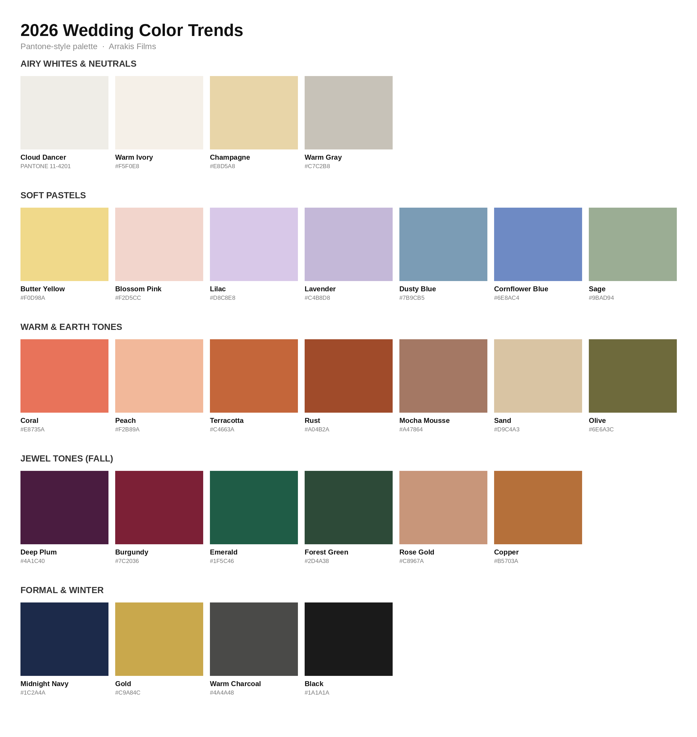
The 2026 palette splits into two moods: quiet, airy neutrals and warm pastels on one side, and saturated jewel and earth tones on the other. Couples are pairing a soft base with a single bold anchor instead of building a full rainbow, and adding a metallic to tie it together. Black is back as an accent for formal weddings. Here are the directions worth planning around.
Airy whites and warm neutrals
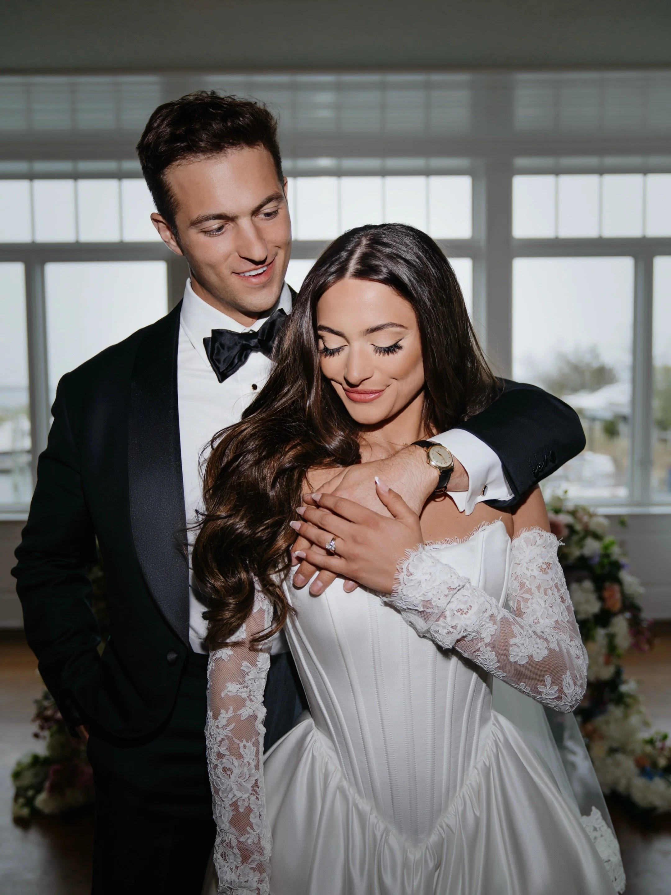
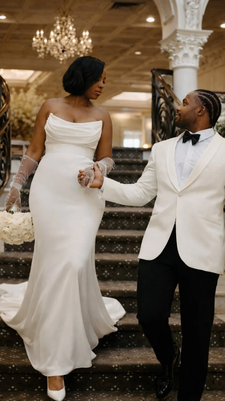
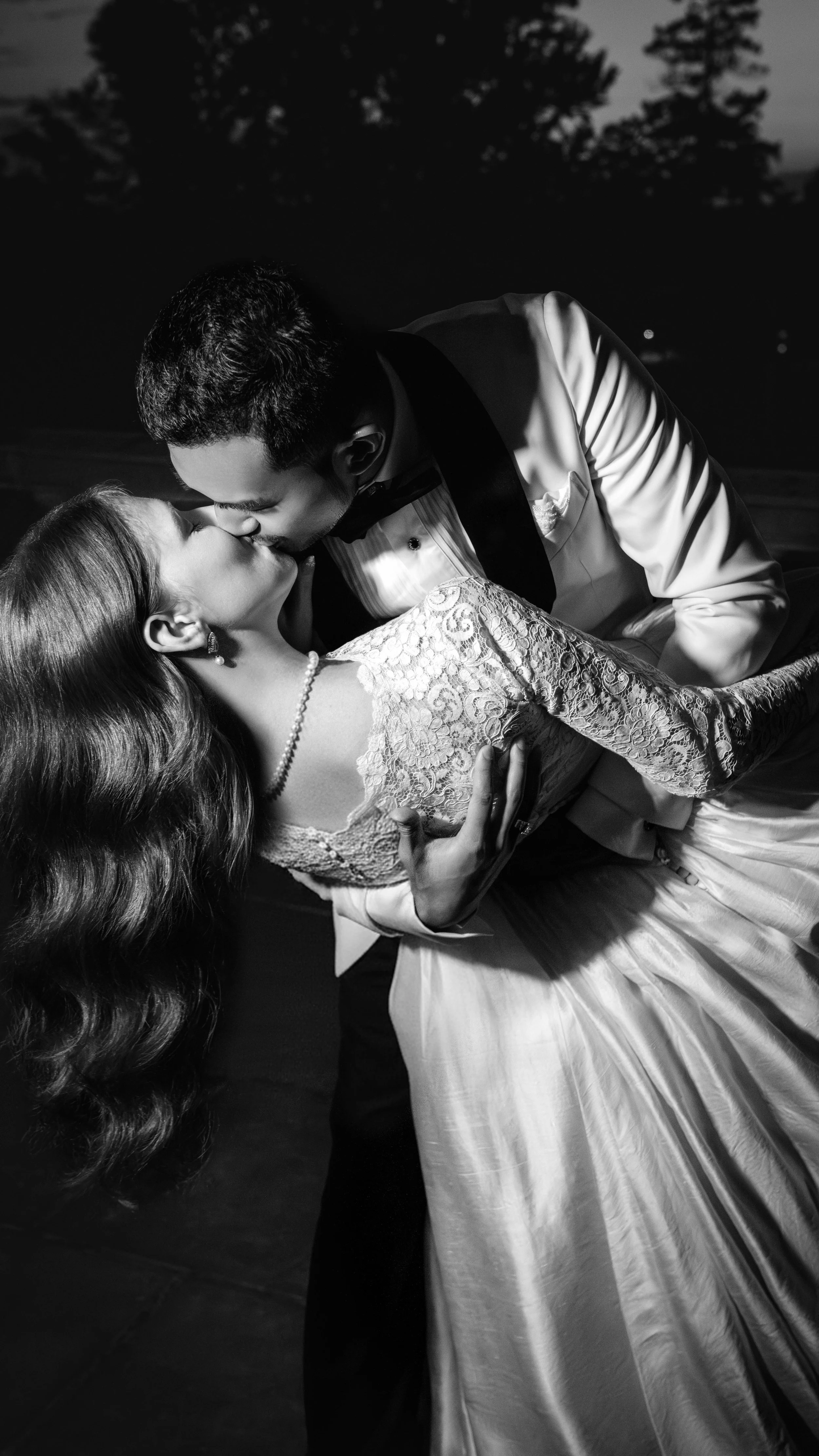
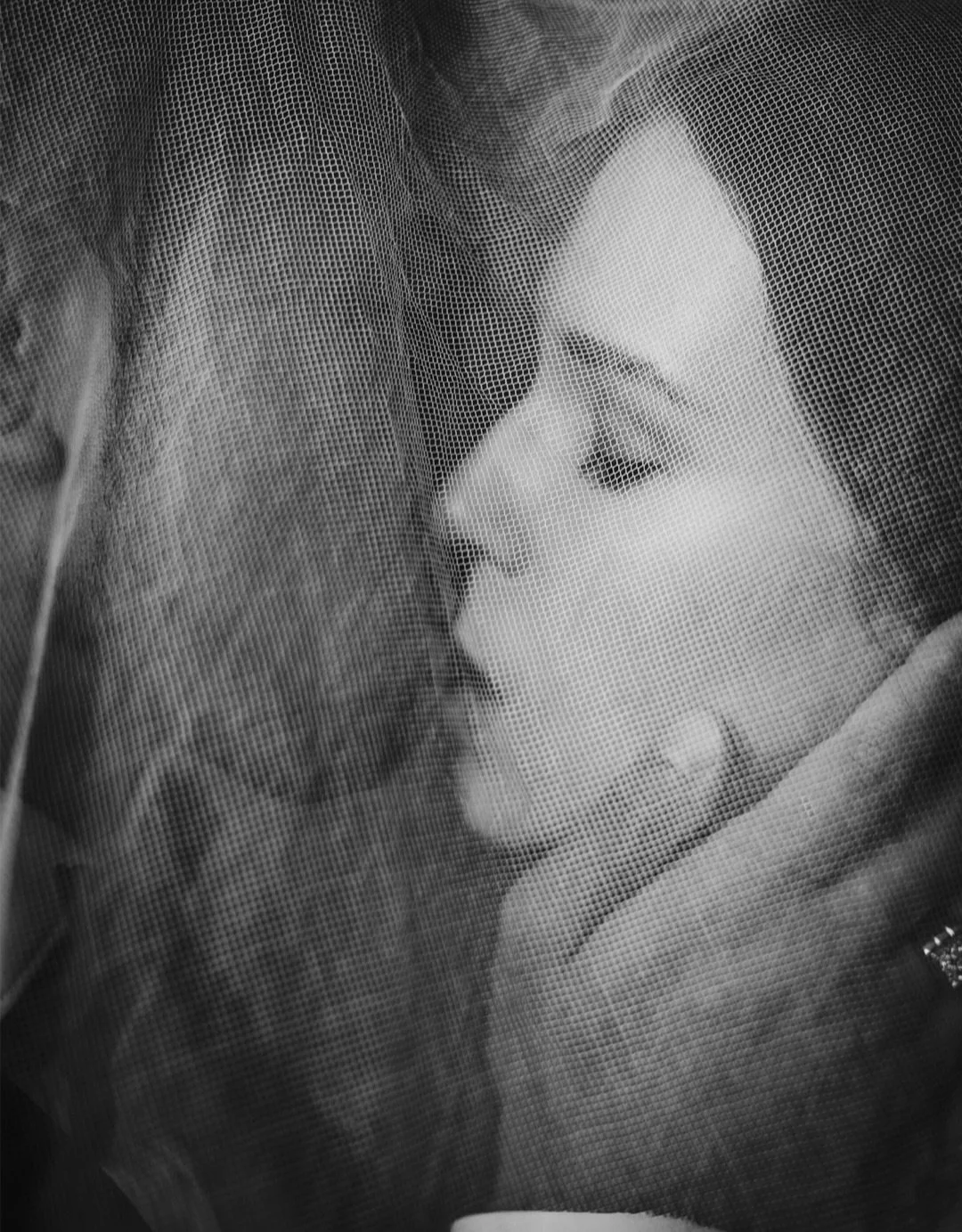
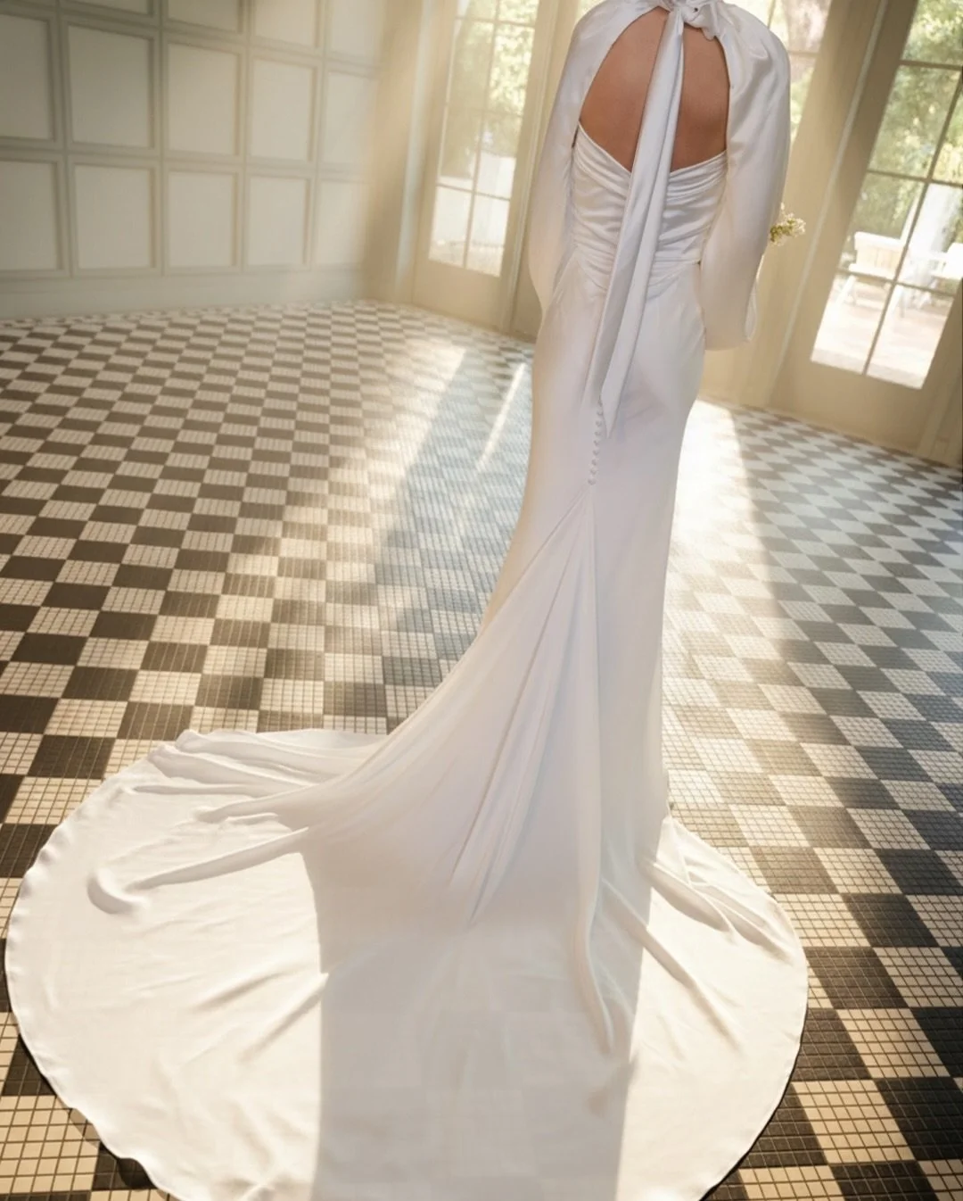
Led by Pantone's Cloud Dancer, 2026 leans into soft white, ivory, champagne, and warm gray. This is the gallery look: clean, elevated, and calm. Best for couples who want an editorial, minimal aesthetic where the flowers and the light do the talking. Photo/film note: an all-white palette lives or dies on white balance and texture, so we light for the warmth in the ivory and the shadow in the folds; get it wrong and the frame reads flat and clinical.
Butter yellow and soft pastels
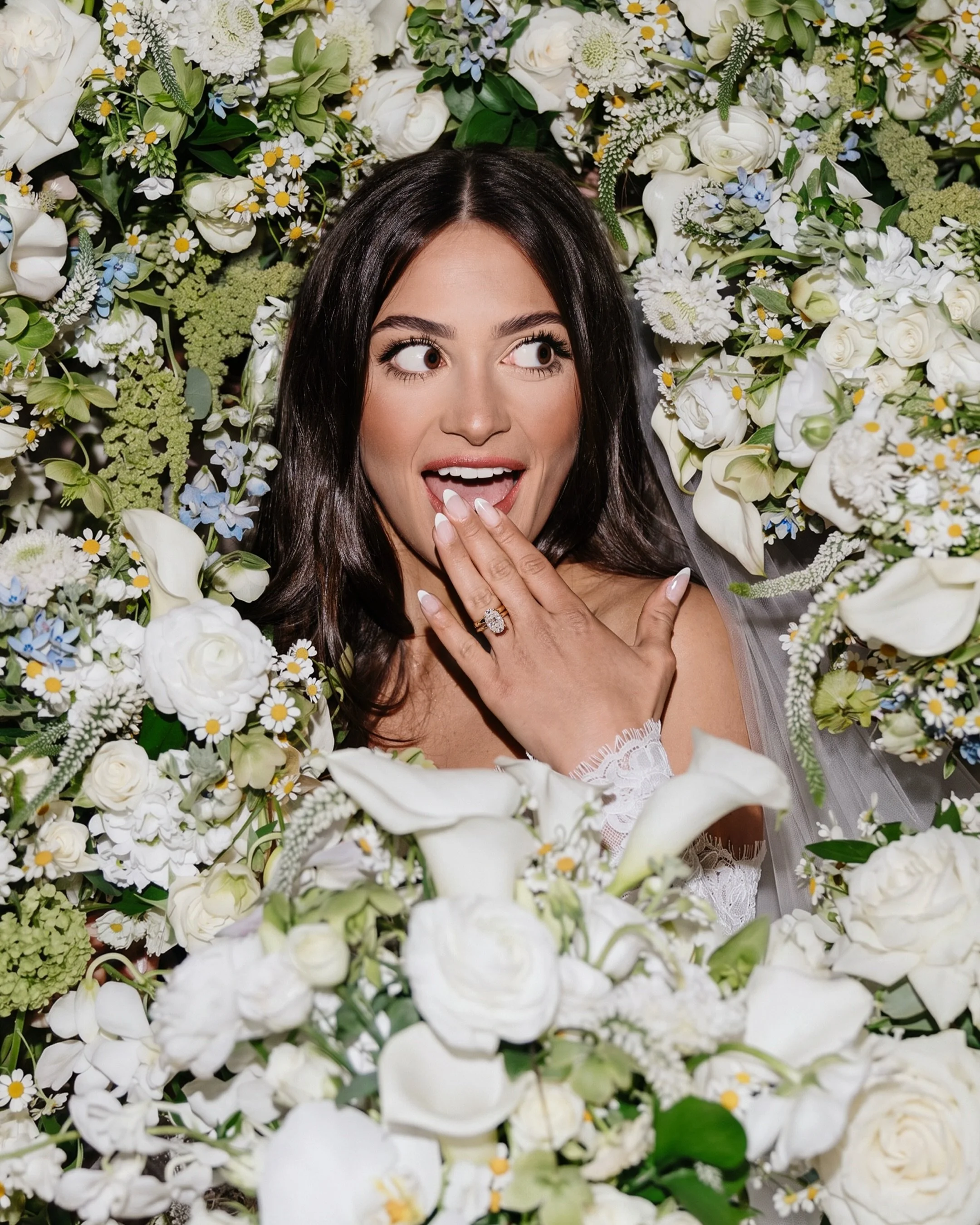
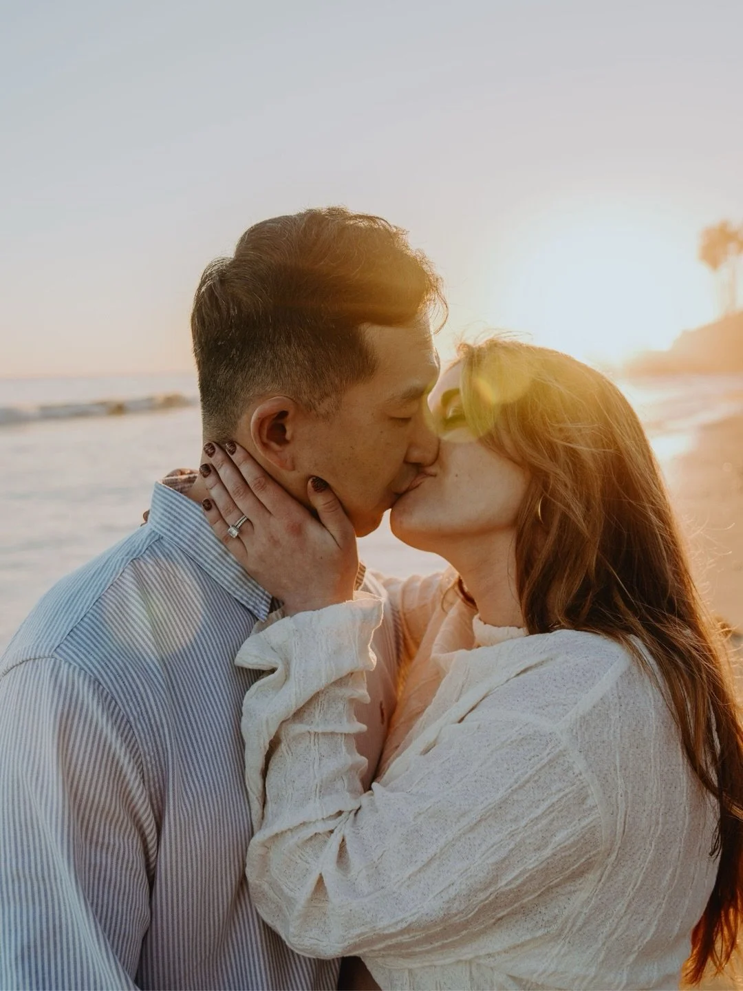
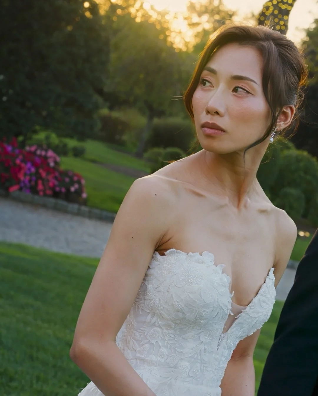
Butter yellow carried over from 2025 and stays a headline color for 2026, joined by lilac, blossom pink, dusty blue, and cornflower blue. These are creamy, low-saturation pastels, not primary brights. Best for spring and summer weddings that want warmth without going bold. Photo/film note: pastels flatter almost every skin tone and hold up beautifully in daylight; the risk is that they wash out under harsh sun, so we shoot them in open shade or at golden hour when we can.
Jewel tones for fall
Deep plum, burgundy, emerald, and forest green anchor the autumn direction, usually paired with rose gold, copper, or deep ivory. These are the richest, most saturated colors of the year. Best for fall and winter weddings in grand or low-lit rooms. Photo/film note: jewel tones are gorgeous on camera but soak up light, so a burgundy-and-emerald reception needs real lighting to keep detail in the darks rather than crushing them to black.
Warm earth tones
Mocha, terracotta, rust, clay, olive, and sand run across all four seasons in 2026, a continuation of the mocha-mousse warmth from 2025. Best for garden, vineyard, desert, and documentary-leaning weddings that want an organic, grounded feel. Photo/film note: earth tones grade warmly and forgive mixed lighting well, which makes them one of the easiest palettes to keep consistent from ceremony to reception on film.
Black as an accent
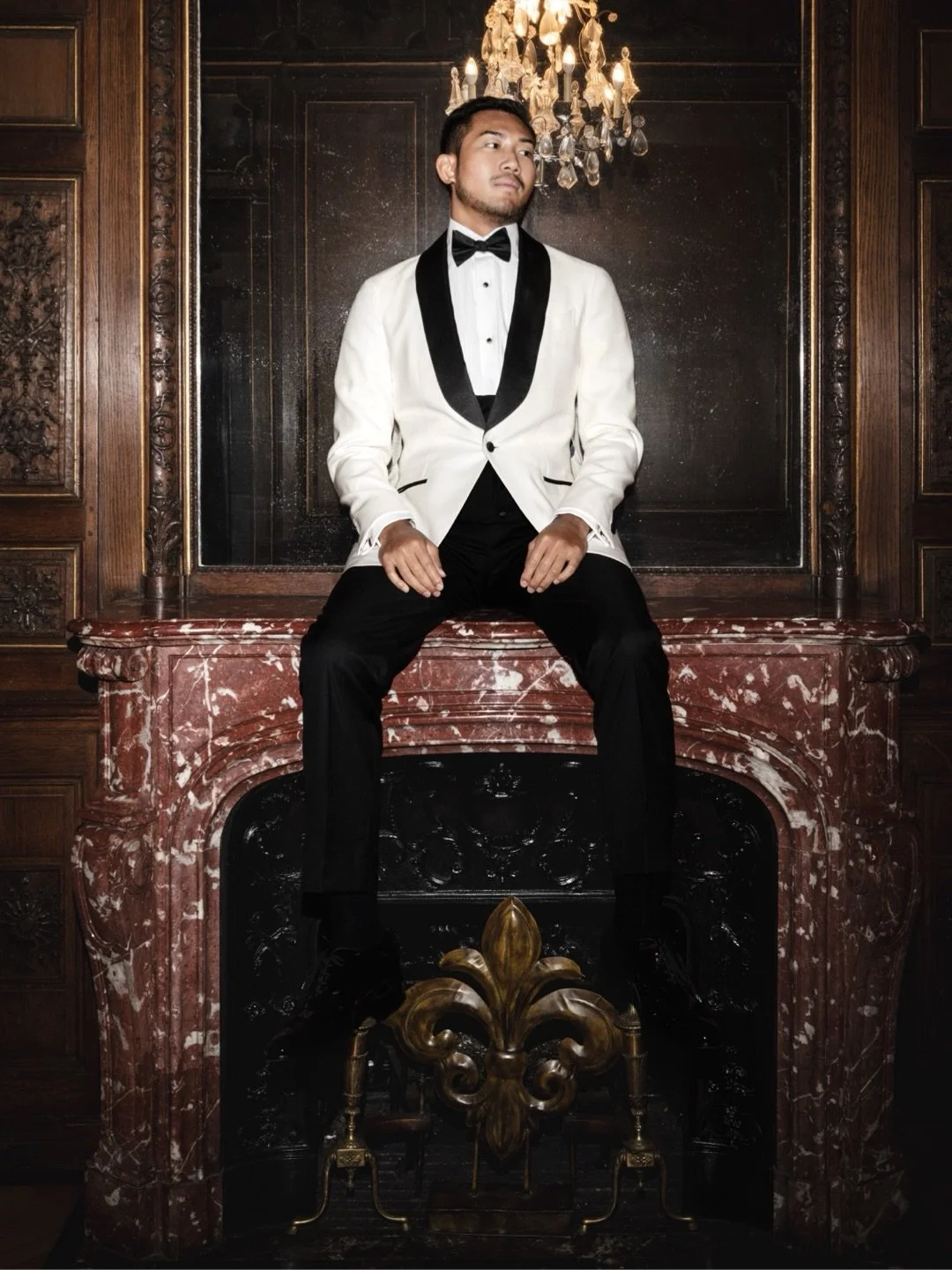
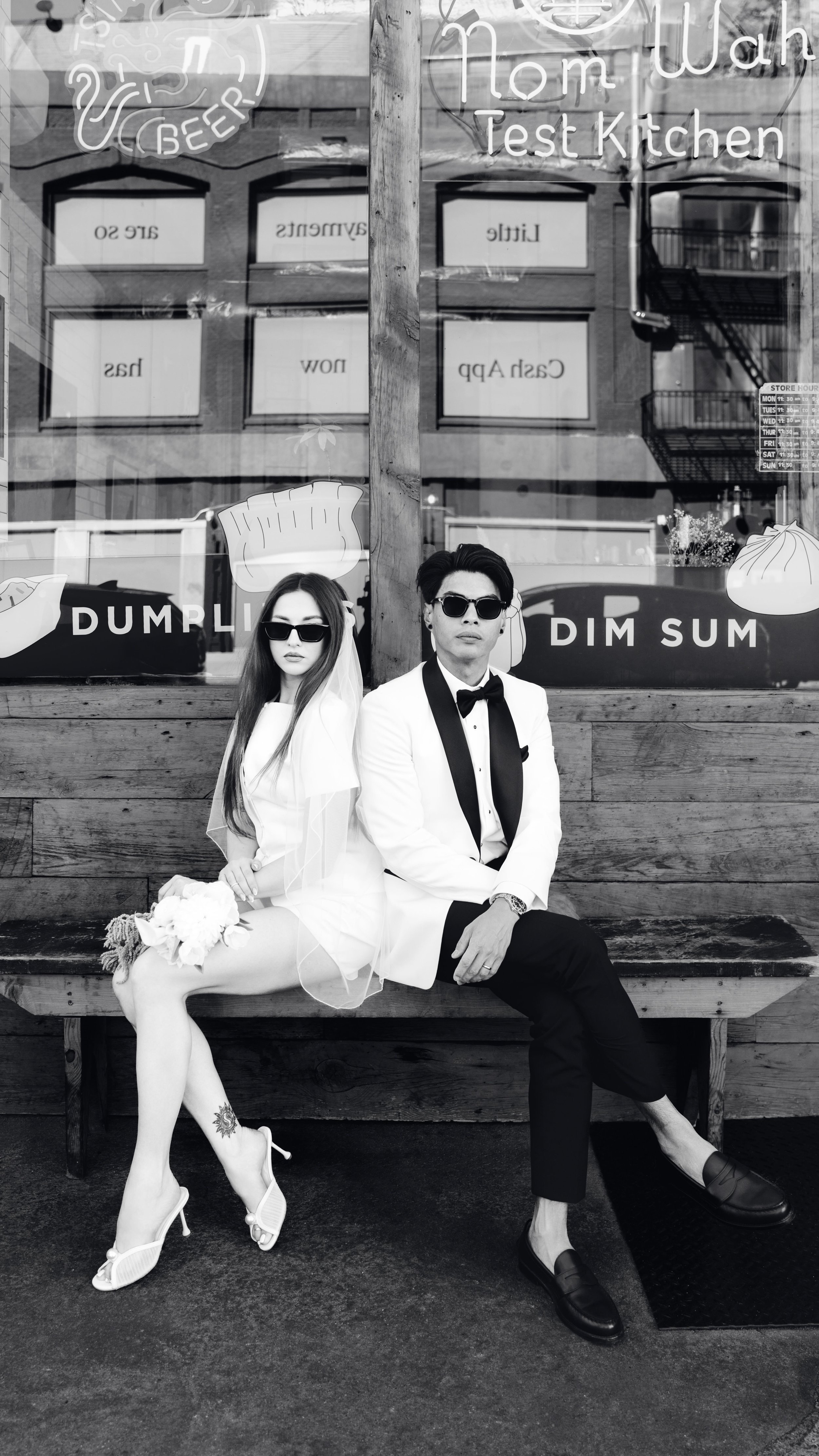
Black is trending as a sophisticated accent for 2026, in tuxedos, linens, candlesticks, and typography rather than as a full palette. Best for formal, city, and evening weddings that want an editorial edge. Photo/film note: black adds contrast and structure to a frame, but a black-heavy reception needs careful exposure so the details in the fabric and the shadows do not disappear.
What is Pantone's 2026 color of the year, and how do you use it?
Pantone named PANTONE 11-4201 Cloud Dancer, a lofty, airy white, its 2026 Color of the Year, the first white ever chosen. Pantone describes it as a calming, quietly optimistic tone meant to feel like a clean slate. At a wedding it works as the base of a palette, not the whole thing, letting one or two accent colors and the greenery carry the drama.
Cloud Dancer suits couples who want a minimal, gallery-like day: white florals, ivory linens, champagne glassware, and a lot of natural light. The move that keeps it from feeling sterile is texture and a single warm accent, raw silk, pampas or olive greenery, aged brass, or a soft blush, so the white reads intentional rather than empty. On camera it is the most demanding palette of the year, because with almost no color to anchor white balance, the lighting and the grade are what separate a soft, luminous frame from a cold, washed-out one.
The best 2026 wedding color palettes by season
| Season | Signature palette | Mood | Best for |
|---|---|---|---|
| Spring | Butter yellow + blush + sage, or lavender + lilac + pale gold | Fresh, light, romantic | Garden and outdoor daytime weddings |
| Summer | Coral + peach + champagne, or dusty blue + white + silver | Warm sunset, or cool and airy | Beach, waterfront, rooftop, vineyard |
| Fall | Deep plum + burgundy + rose gold, or forest green + ivory + copper | Rich, saturated, warm | Ballrooms, estates, low-lit evening rooms |
| Winter | Mocha + champagne + warm ivory, or midnight navy + gold + ivory | Cozy and warm, or deep and formal | Holiday-season and black-tie weddings |
Season drives palette more than any trend does, because it controls the flowers available, the light quality, and the temperature guests are dressing for. Below is a concrete palette for each season, built from 2026 forecasts, with the mood it sets and who it fits. Every combination pairs a soft base, a saturated anchor, and a metallic, the structure that reads cleanest on camera.
Spring 2026
Butter yellow, soft blush, and sage, or soft lavender, lilac, and pale gold. Fresh, light, and optimistic, built for daylight and garden settings. Best for: outdoor spring weddings, garden venues, and couples who want a bright, romantic feel. Photo/film note: these palettes are made for open shade and overcast light, both of which flatter pastels; a sunny midday ceremony needs shade or diffusion to keep them from blowing out.
Summer 2026
Coral, peach, and champagne for a sunset feel, or dusty blue, soft white, and silver for a cooler, airier look. Best for: beach, waterfront, rooftop, and vineyard weddings from June through August. Photo/film note: warm summer palettes sing at golden hour, so we build the timeline to shoot portraits in that last hour of light; the cool dusty-blue direction holds up better under bright midday sun.
Fall 2026
Deep plum, burgundy, and rose gold, or forest green, deep ivory, and copper. Rich, saturated, and warm, the signature autumn direction. Best for: September through November weddings, especially in ballrooms, estates, and grand low-lit rooms. Photo/film note: these are the most light-hungry palettes of the year, so a dim reception needs professional lighting to keep the darks from going muddy and the copper from turning brown on camera.
Winter 2026
Mocha, champagne, and warm ivory, or midnight navy, gold, and ivory. Warm and cozy, or deep and formal. Best for: December through February weddings, holiday-season celebrations, and black-tie evenings. Photo/film note: winter light is short and low, so we plan the daylight portraits early and light the whole reception; navy and gold in particular need controlled light to separate from a dark room.
How do you choose colors that photograph well?
Choose a palette with three roles filled: a soft base, one saturated anchor, and a metallic or neutral to tie them together. Limit it to three or four colors total. Match the palette to your light, pastels and whites for bright daylight, jewel and earth tones for low-lit or evening rooms, and pick colors that flatter your whole party's skin tones, not just the mood board.
The most common mistake we see is a palette that looks perfect on a screen and falls apart in the room. Bright, high-saturation colors like fuchsia or cobalt can cast their color onto skin in direct sun, tinting faces in the portraits. All-white palettes go cold without a warm accent and good lighting. And a palette with five or six competing colors reads busy on film, where everything is moving. The palettes that photograph best are the disciplined ones: a clear base, one hero color, and greenery or metal doing the connective work. If you send us your palette before the day, we plan lighting and white balance around it, which is the difference between colors that match your vision and colors that fight the room.
Which 2026 colors fit your venue type?
Venue sets the backdrop your palette has to live against, so the smartest color choices are the ones that work with the walls, the light, and the setting rather than against them. Here is how the 2026 directions map to the three most common venue types.
Beach and waterfront: soft blues, sand, champagne, and warm neutrals. The dusty-blue and coral summer palettes were built for this light. Skip heavy jewel tones, which fight the airy, sun-bleached setting.
Garden and outdoor: sage, butter yellow, blush, lavender, and terracotta. The greenery is already in the frame, so a soft pastel or earth-tone palette extends it instead of competing with it.
Urban and industrial: black accents, champagne and gold metallics, deep plum, emerald, and warm charcoal. City and loft venues carry saturated, structured palettes well, and the metallics play off glass, brick, and steel.
How we shoot color so photo and film match
Color is where photo and film most often drift apart, because two separate vendors grade to two different looks and your burgundy reads wine-red in the photos and brown in the video. We run photo and film as one team off a single color reference, so the palette you chose is the palette you get back in both.
We set a custom white balance for each lighting situation, ceremony, golden-hour portraits, and reception, so whites stay white and your accent color stays true instead of shifting warm or cool. We light dark and jewel-toned receptions so saturated colors keep their detail rather than crushing to black. We shoot photo and film to a shared color target and grade them to match in post, so the two galleries feel like one story. And we ask for your palette ahead of the day, so nothing about the color is a surprise when we walk in.
See our photo and film packages
Who this fits: couples who chose their colors carefully and want them to survive contact with real light, on both the photos and the film. If your palette is soft and airy, the work is in the white balance; if it is deep and saturated, the work is in the lighting. Either way, it is planned before the day, not fixed after.
Frequently asked questions
-
The headline 2026 wedding colors are airy whites led by Pantone's Cloud Dancer, warm pastels like butter yellow, lilac, blossom pink, and cornflower blue, jewel tones like deep plum, burgundy, and emerald for fall, and earth tones like mocha, terracotta, and rust across all seasons. Black is trending as a formal accent rather than a full palette.
-
PANTONE 11-4201 Cloud Dancer, a soft, lofty white, is Pantone's 2026 Color of the Year, the first white the company has ever chosen. Pantone frames it as a calm, quietly optimistic clean slate. At weddings it works best as a palette base, paired with texture and one warm accent so it reads elevated rather than sterile.
-
Fall 2026 is defined by rich jewel tones: deep plum, burgundy, and emerald or forest green, usually paired with a warm metallic like rose gold or copper and a deep ivory. These saturated palettes suit ballrooms, estates, and low-lit evening receptions, though they need real lighting on camera to keep their depth instead of going muddy.
-
Palettes with a clear structure photograph best: a soft base, one hero color, and greenery or metal doing the connective work. Pastels and warm neutrals flatter most skin tones in daylight, while jewel and earth tones look rich in low light with proper lighting. Very bright, high-saturation colors like fuchsia or cobalt can cast onto skin in direct sun, so they need shade.
-
Not if it is used as a base rather than the whole palette. An all-white day feels intentional when it carries texture, raw silk, pampas or olive greenery, aged brass, and one warm accent like blush or champagne. The risk is not plainness but a cold, washed-out look on camera, which is a lighting and white-balance problem, solved before the day.